
I have tested the XIAO ePaper DIY Kit (ESP32-S3) – EE04 from Seeed Studio in depth. While its 6-color Spectra 6 display is impressive out of the box, I wanted to see if software could overcome hardware limitations. In this post, I’ll share how I’ve pushed this hardware to its limits by using dithering techniques to simulate an entirely new range of color tones and shades.
Table of Contents
ToggleHardware Analysis
The hardware is composed of two elements. The first one is the controller board. It features several push buttons, an ON/OFF switch and a charging circuit to power the device via battery and charge it through the USB connector. The main components are an ESP32-S3 Plus and two flat cable connectors (24-pin and 50-pin) to connect our e-paper displays depending on their specifications.
While it is quite well-known, the integration of an ESP32-S3 offers great development opportunities thanks to its easy-to-use Wi-Fi and BLE support. I think it’s an excellent choice. There are also modules developed with an nRF instead of an ESP. Evaluating this option is important because the idle power consumption of nRF chips is usually much better than the power consuption of an ESP, which could significantly increase battery life.
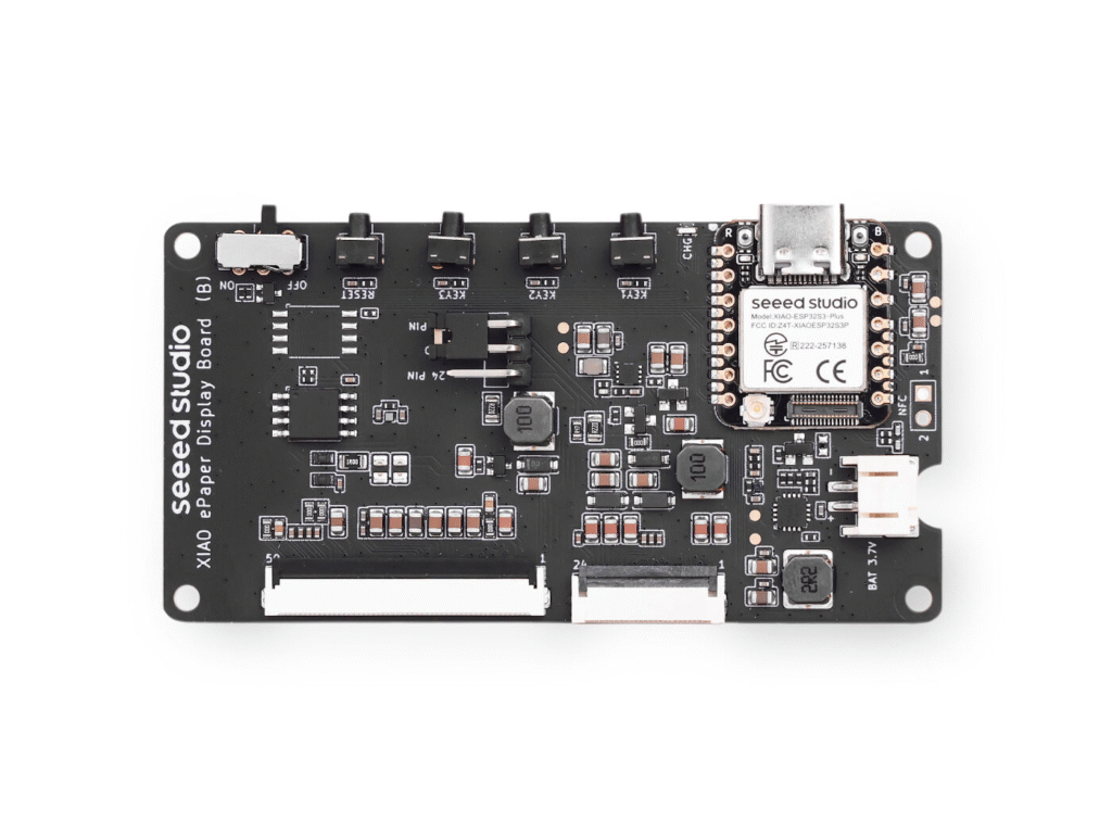
Secondly, there is the e-paper display, which you can choose in different sizes: 1.54, 2.13, 2.9, and up to 7.5 inches. You can also choose between monochromatic displays or versions with up to 6 colors.
How SPECTRA 6 E-INK Works
In my case, I acquired the 7.3″ Spectra™ 6 E-Ink display, which supports up to 6 colors: White, Black, Yellow, Red, Green, and Blue. As with other Seeed Studio terminals, it can be configured using their SenseCraft web application if you prefer not to program and want something ready to go quickly. I won’t go into detail about that, as there is plenty of information online and it is quite intuitive. However, I prefer the DIY approach, so I started developing something from scratch.
First of all, these types of color displays have a much slower full-screen refresh rate compared to monochromatic ones. This may seem obvious, as the canvas must be refreshed for each color independently. This is because the E-Ink Spectra 6 / ACeP terminal contains microcapsules with several color pigments inside. Depending on the voltage applied to each pixel, a specific colored fluid is moved toward the visible surface so we can see it, while the other colors for that pixel remain hidden.
GIF from: https://www.eink.com/tech/detail/How_it_works
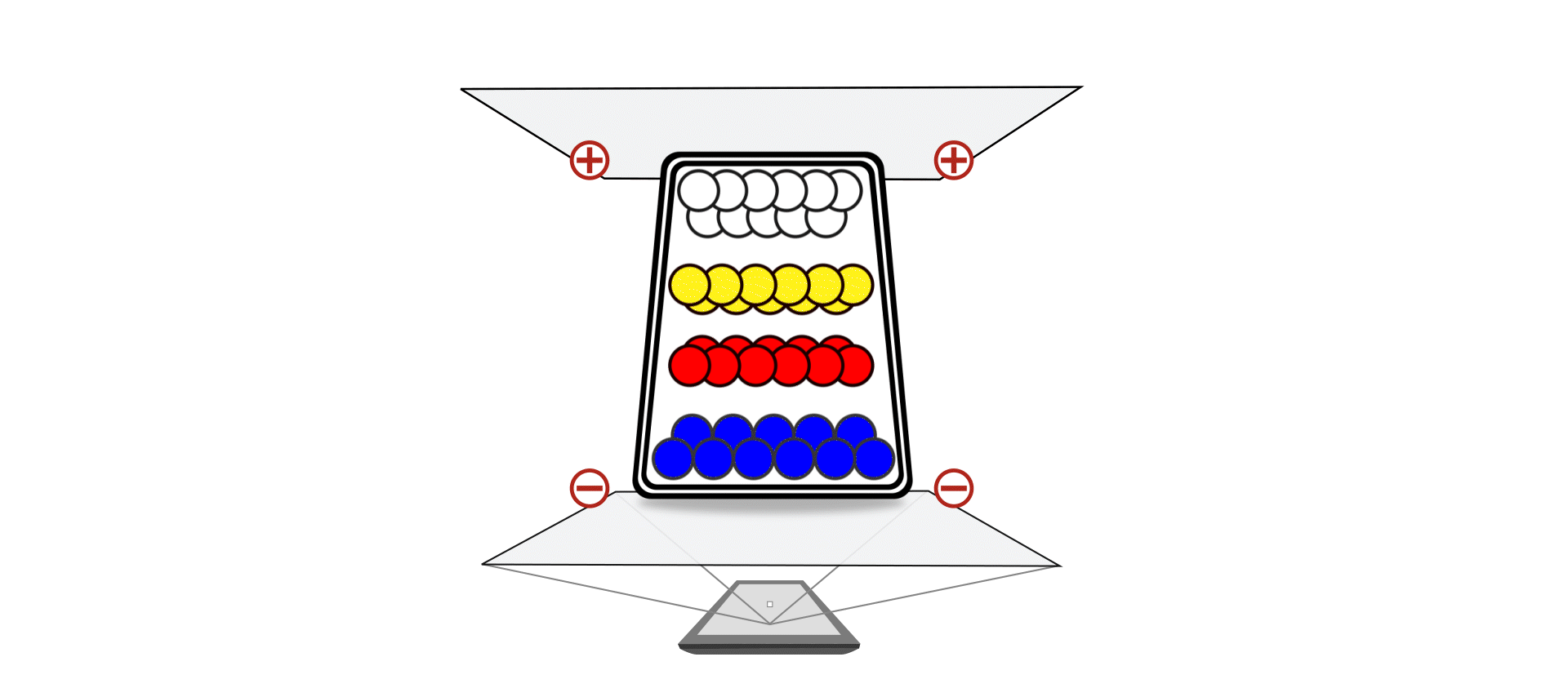
Since the color is physically formed within each pixel, refreshing all pixels takes time. It is important to highlight this for your implementations: you won’t be able to create content that requires frequent updates. A full refresh takes between 20 and 30 seconds, during which the screen flashes intensely as the pigments are rearranged. This rules it out for clocks with second hands or real-time notifications, but makes it the ideal candidate for static dashboards, signage, or low-power digital art.
Regarding programming the display via the Arduino IDE, Seeed Studio provides a guide on how to do it at https://wiki.seeedstudio.com/epaper_ee04/ using their Seeed_GFX library, which is based on TFT_eSPI. I have encountered some limitations, such as the inability to perform hardware screen rotation, but for basic tasks like drawing pixels, rectangles, strings, and setting fonts, it works well.
The Challenge of SPECTRA 6 E-INK
Aside from the 6 native colors, I wanted to investigate whether it was possible to achieve more shades using techniques like dithering. This process involves simulating intermediate colors by creating specific pixel patterns, effectively “tricking” the eye into seeing more variety even though the terminal can only toggle between the six available colors. While dithering is commonly used in image processing to convert high-color photos into e-paper formats (like the Floyd-Steinberg algorithm), it is rarely applied directly to coding.
My goal was to research the application of dithering techniques to simulate a wider range of colors when drawing basic shapes: such as rectangles, lines, or filled logos. These are the exact graphical primitives provided by standard Arduino and ESP32 libraries.
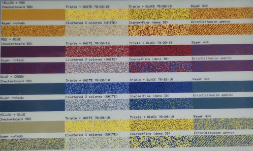
Of all the patterns I tested (which you can see in the photos below), the one that gave me the best results was the simplest: a “50% checkerboard” between two colors. This follows a basic A-B-A-B pattern.
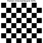
I also tried other patterns like Rotated Bayer, which worked well for certain colors, but for my specific needs but for my specific needs, it introduced noticeable geometric artifacts that distracted from the clean lines of the UI elements. While more complex algorithms like Rotated Bayer or Error Diffusion are excellent for photographic gradients, they often struggle with small-scale graphical primitives. The 50% checkerboard, on the other hand, maintained a perfect balance between color blending and structural clarity, making it the most reliable choice for drawing sharp, multi-tone shapes on the Spectra 6 display.
| Dithering Method | Technical Description |
|---|---|
| Checkerboard 50% | Alternates pixels in a chessboard pattern to simulate a 50/50 blend. Simple and very fast to render. |
| Triple + WHITE 70/20/10 | Uses three colors with specific proportions (e.g., 70% color A, 20% color B, 10% white) to simulate lighter tones. |
| Triple + BLACK 70/20/10 | Same as above, but uses black instead of white to simulate darker or deeper shades. |
| Bayer 4×4 | Ordered dithering using a 4×4 matrix with predefined thresholds. Produces smooth and regular patterns. |
| Bayer Rotated | A rotated variant of the Bayer 4×4 to avoid visible repetitive patterns. Improves visual dispersion. |
| Clustered 3 colors (WHITE) | Groups similar pixels to form color “spots.” Frequently used in halftone-style printing. |
| CoarseFine (dens 30) | Combines thick and thin patterns to control blend density. Useful for simulating textures. |
| ErrorDiffusion Approx | Propagates quantization error to neighboring pixels for smooth transitions. Classic example: Floyd–Steinberg. |
With that pattern, I decided to mix all the colors available on the display.
As you can see, these resulting colors are quite effective for drawing various shapes with a polished look. Colors like Purple, Brown, and Sky Blue are very accurate; however, in my opinion, the blends mixed with white don’t quite manage to trick the eye enough.
Next, I ran some tests printing drawings to see how the colors behaved. While a specific color might look great in a geometric shape like a rectangle, it might not perform as well in other types of images.
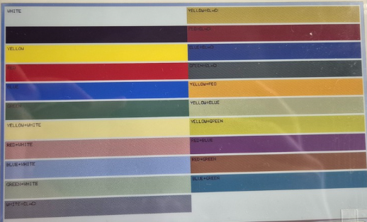

As you can see, I have drawn five suns at the top using the display’s native pure colors, and at the bottom, the colors resulting from mixing them. Even when drawing suns, the colors remain very effective. In this way, we have managed to achieve illusory colors for:
| Color | Native on display? | Dithering |
|---|---|---|
| Black | Yes | — |
| White | Yes | — |
| Red | Yes | — |
| Yellow | Yes | — |
| Green | Yes | — |
| Blue | Yes | — |
| Orange | No | Red + Yellow |
| Light Yellow | No | Yellow + White |
| Lime | No | Green + Yellow |
| Purple | No | Red + Blue |
| Brown | No | Red + Green |
| Cyan | No | Green + Blue |
| Light Pink | No | Red + White |
Conclusion
In summary, this kit is a great demonstration of how far e-ink technology has come in recent years. It’s not just about the six native colors, but also about what can be achieved by playing with patterns and color blending. The combination of the ESP32-S3 with the Spectra 6 display offers plenty of room for experimentation: ranging from information panels to more elaborate interfaces that take advantage of the low power consumption and the unique aesthetic of ePaper.
Throughout this post, I’ve highlighted what truly matters when working with these displays: color behavior, limitations, which combinations work best, and what to expect from the refresh rate. These are the details that make all the difference when you start designing icons, layouts, or dashboards that actually look good.
Ultimately, this kit is an excellent foundation for anyone looking to tinker with ePaper without getting bogged down in complexity. It allows you to learn, test ideas, and better understand how these multicolor panels function. Above all, it opens the door to projects that can look visually stunning if you play to the screen’s strengths.
What do you think of the results? The theory is clear, but practice is where it gets interesting. In my next post, I will explain how to convert images into arrays and display them as efficiently as possible. It’s a process with its own set of tricks, especially regarding multicolor ePaper, so I’ll break it down step-by-step so anyone can implement it easily.
Pingback: 在Spectra 6色e-Ink显示屏上探索抖动技术 - 偏执的码农
Looking forward to your next post, I’m interested in how to achieve it.
Thanks! Subscribe to my newsletter to stay updated
The 7.0′ does not officially support Orange as well. That is in contrast to 4.0′ and 13.3′, which don’t support this.
https://github.com/waveshareteam/e-Paper/pull/377
Hi Patrick
Orange is not natively supported. However, in the post I mention that it’s possible to achieve that color with dithering, but it’s not natively supported by the display.
I’ve used Photoshop to create a special palette for this display. It also does the dithering very well.
Photoshop can also save as a 4-bit bitmap, which can then be embedded directly into code (in some compilers), making life easy.
See it here: https://forums.parallax.com/discussion/177818/full-color-e-ink-displays#latest
Pingback: Serverless e-Ink Photo Frame: Using Google Drive for unlimited storage